CASE STUDY 05 · 4 MIN READ
Encuentra tu Fisio
Home physio, booked in minutes.
When something hurts, nobody wants to read. They want to know who can help, and when.
Encuentra tu Fisio sends physiotherapists to people’s homes. At UNANIME I designed its landing page and the booking flow: specialty search by postcode and a three-step booking.
The challenge
How might we take someone in pain from “I need a physio” to a booked home visit in a few minutes?
Hypothesis
If services are named after the pain and booking takes three steps, more people will finish a booking on their first visit.
How I work
I start from the user’s situation, cut every step that isn’t needed, and review the flow with real users.
A landing that speaks like the patient. People search by what hurts, pick a physio and a time, and get the session at home, in three steps.
Book in three steps
Three steps, exactly as on the live site.
- Choose your specialty. Tell us what hurts and where you are.
- Book your session. Pick a physio and a time that doesn’t interrupt your day. Pay online.
- Get your session at home. The physiotherapist comes to you.
Why
Every extra field loses someone who is already uncomfortable. Three short steps feel doable, even from the sofa.
How I would measure it
Booking completion rate per step, to see exactly where people drop off. Tool: GA4 funnel.
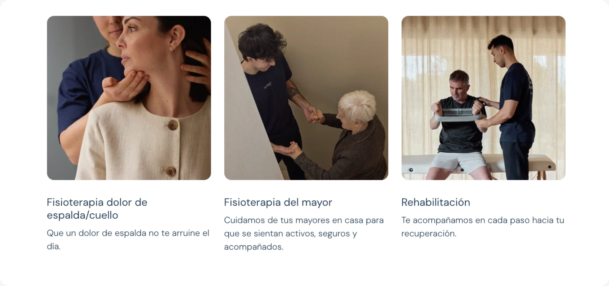
Services named after the pain
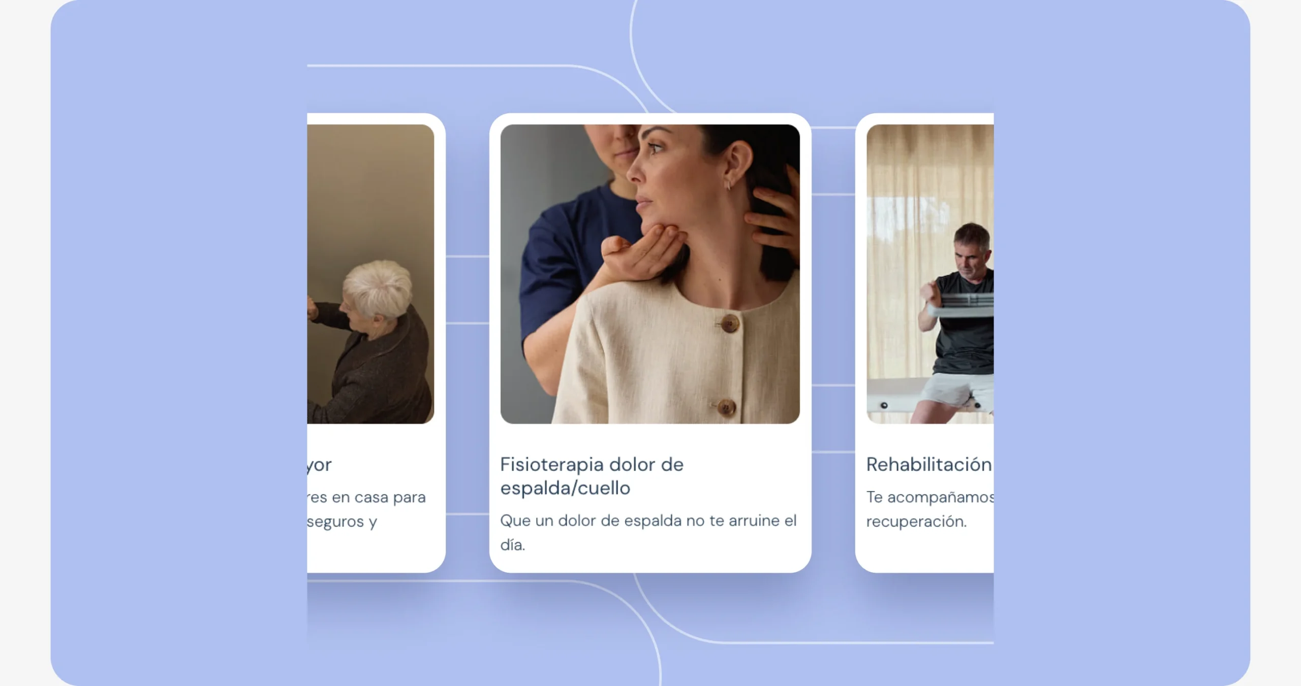
Each specialty is written the way patients describe their problem, with a photo of the team at work in a real home.
Why
People in pain search for “my back hurts”, not for “manual therapy”. Speaking their language shortens the search and builds trust.
How I would measure it
Searches started from each specialty card, and time to the first search.
Calm, human visuals
Soft blues, plenty of white and real photography instead of stock: the brand feels like care, not like a clinic.
- Calm · soft blue
#AFC0F0 - Trust · navy
#1F2A44 - Space · white
#FFFFFF - Base · mist
#F3F5FA
- Mona Sans ExtraLight for headlines: calm, never shouting at someone in pain
- DM Sans for body: round, friendly and readable for older users
Why
Health services can feel cold. A calm palette and real faces make inviting a stranger into your home feel safe.
How I would measure it
Booking completion among users over 60, and a short trust survey after the first session.
Why this work matters
The site is live and the UX review is in progress. These are the numbers that would prove the flow works.
00 → 00
Booking completion rate, before and after the new flow.
Bookings finished
Bookings completed versus started, step by step.
Feels safe
Would you let this physio into your home? A short survey after the visit.
Time to book
Minutes from landing to a confirmed session.
What I learned
Key takeaway
In health, clarity is care: plain words and real faces did more for trust than any visual effect.
With more time, I’d…
- Finish the UX review with real patients
- Measure booking completion step by step
- Add reviews from patients next to each specialty
With less time, I’d…
Ship search and the three-step booking first, and add specialty pages and the team page later.
That’s the short version. The full process is below if you want the evidence.
- Search by problem Back pain, older adults, rehab: not clinical jargon.
- Book in three steps Treatment, time, details. Nothing else.
- Trust real people Real physios and real homes in every photo.
Starting from the patient
I started from the client’s services and from how other home-physio and health-booking sites organise their offer and their booking.
From structure to interface
I started in low fidelity to agree layout and hierarchy before adding the brand.
A system for the platform
Cards for specialties, booking steps, buttons and form fields as reusable components, so every step of the booking feels familiar.
Accessible by default
- Large, legible type for older users
- High contrast on buttons and form fields
- Every form field with a visible label
Feedback and iterations
Agencies rarely have time for formal testing, so I validate with what we have: client feedback rounds, team reviews and quick checks. This is what changed because of it.
How I validated it
- Feedback rounds with the client
- UX review of the live booking flow with the UNANIME team
- Next: measure drop-off at each booking step