CASE STUDY 06 · 4 MIN READ
Aerum
Skincare, calm and clinical.
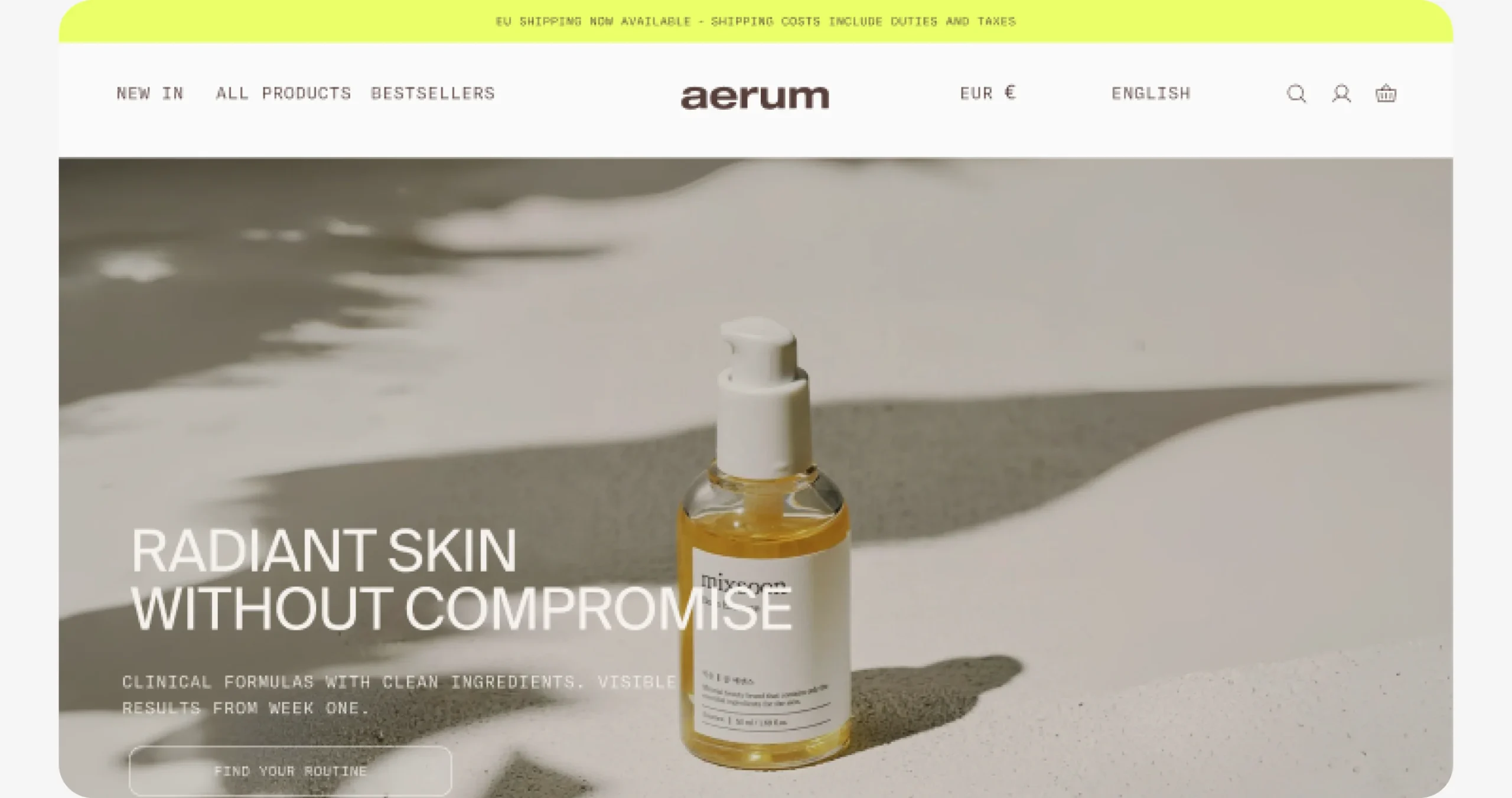
Skincare shoppers don’t need more products. They need to know which ones are for them.
Aerum is a concept skincare store: clinical formulas with clean ingredients, made with Korean formulators. I designed its e-commerce home as a personal project, from wireframe to a full design system.
The challenge
How might an online shop feel as calm and honest as the products it sells, and still help people buy?
Hypothesis
If the home guides people by skin need and lets the product photography lead, shoppers will find their routine faster and add to bag with more confidence.
How I work
I plan every section around one question, design the system before the screens, and let the content lead.
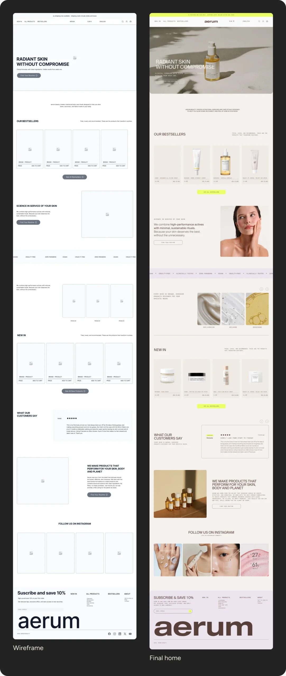
One long home, one question per section. The hero sets the mood, the grid makes products easy to compare, reviews prove it quietly and the lavender footer closes the ritual.
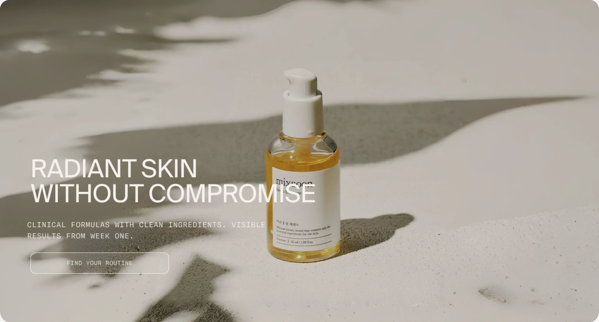
Let the photography breathe
I placed the hero first with minimal text over the image: the product and its texture set the mood before any copy does.
Why
In skincare, texture sells. A quiet hero gives the photo all the attention and sets a calm, premium tone from the first second.
How I would measure it
Scroll depth past the hero, and clicks from the hero into a routine. Tool: GA4 and heatmaps.
A grid you can trust
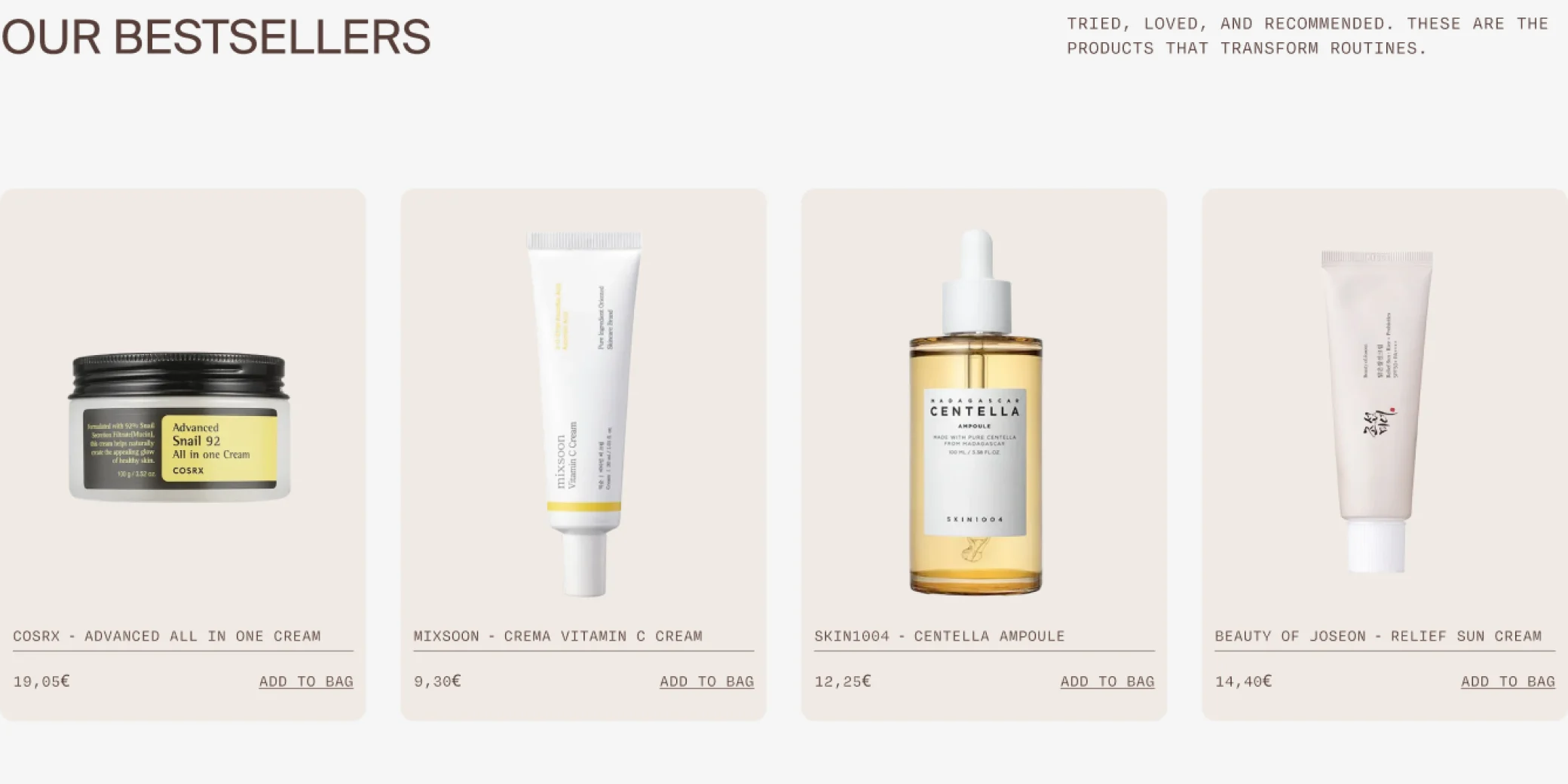
Bestsellers and New in share the same grid: white backgrounds, the same light, the same shadow. Price and “add to bag” always in the same place.
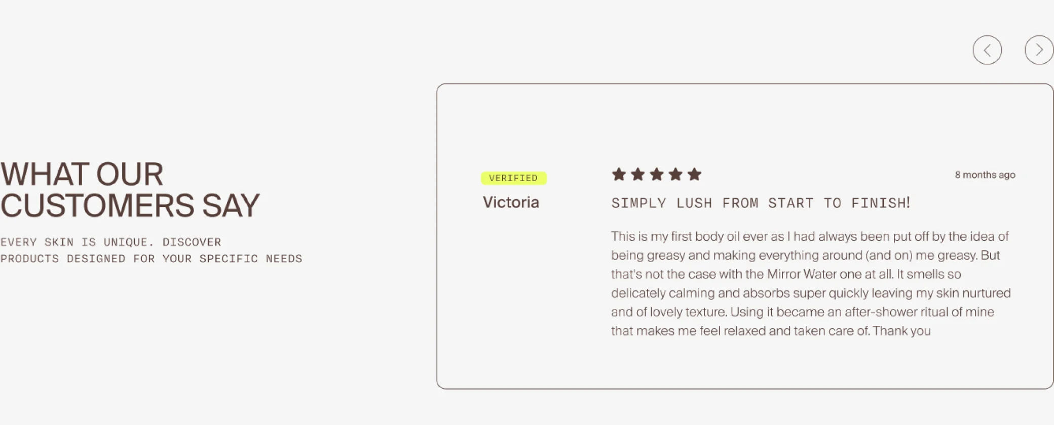
Reviews appear as a single card with five stars and a yellow “verified” badge, instead of a carousel of quotes.
Why
When every product is shot and laid out the same way, people compare products, not photos. One honest, detailed review is more believable than ten short ones.
How I would measure it
Add-to-bag rate from Bestsellers and New in, compared product by product.
A palette that lets the product speak
Warm neutrals taken from skin and packaging, one lime accent kept for what matters, and a soft lavender to close the page.
- Base · cream
#F5F1ED - Warmth · clay
#A87E67 - Text · espresso
#2E1F1C - Accent · lime
#D7F625 - Close · lavender
#DDCADC
- Suisse Int’l for headlines and body: clinical without feeling cold
- Degular Mono for short labels like “vegan” or “clinically tested”
Why
Neutral colours make every product photo the most colourful thing on the page. The lime appears only on what I want people to notice.
How I would measure it
A 5-second test with shoppers: do they describe the brand as calm and clinical?
Why this work matters
Aerum is a concept, so there are no sales to show. These are the signals I’d track from launch day.
00 → 00
Add-to-bag rate from the home in the first month.
Add to bag from the home
Shoppers who add a product without leaving the home.
Calm and clinical
Which words do shoppers use for the brand after five seconds?
Routine found
Time to find a routine for a given skin need.
What I learned
Key takeaway
A calm page still has to sell. The hardest part was knowing what to leave out, so each section had one job and enough space to do it.
With more time, I’d…
- Test the home with real skincare shoppers
- Design the product page and the routine finder
- Add the mobile version and the checkout flow
With less time, I’d…
Ship the hero, Bestsellers and the newsletter first, the three sections that sell, and add Philosophy and Sustainability later.
That’s the short version. The full process is below if you want the evidence.
- Find a routine fast Guide people by skin need, not by catalogue.
- Trust the formulas Show proof without shouting.
- Feel calm, not pushed Space, rhythm and quiet type.
Planning the shopping journey
I planned the home as a sequence: each section answers one question a shopper has, in the order they have it. I worked it out in grey boxes before any photography.
What the research told me
- Shoppers look for a routine for their skin need, not for a product name.
- Trust comes from clear claims and honest reviews, not from discounts.
- Most beauty shops feel crowded; a calm page would stand out.
From structure to interface
I started in low fidelity to agree layout and hierarchy before adding the brand.
Wireframe → final: the same structure, with the brand layered on top.
Rhythm: centred, then two columns
I alternated centred sections with two-column ones so a long page never feels stacked. A long home needs pauses.
Closing in lavender
The footer switches to soft lavender, with the oversized wordmark and the newsletter offer: the end of the page feels like the end of a ritual.
A system for the whole shop
Product cards, buttons, badges and the type scale built as components, so new pages keep the same calm.
Accessible by default
- Text contrast checked on every neutral background
- Product names and prices readable at a glance
- Clear focus states and labels on the newsletter form
Feedback and iterations
Agencies rarely have time for formal testing, so I validate with what we have: client feedback rounds, team reviews and quick checks. This is what changed because of it.
How I validated it
- Peer reviews with other designers
- Self-review against accessibility checks
- Next: usability test with 5 skincare shoppers