CASE STUDY 04 · 4 MIN READ
TipiTop Tents
Selling a tent as an experience.
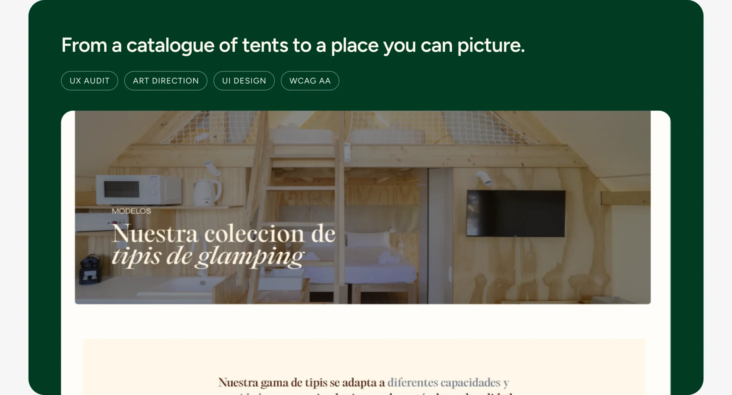
A campsite owner doesn’t buy a tent. They buy what their campsite could become.
TipiTop Tents makes and installs premium tipis for glampings. Their site listed products, not the experience their clients sell. A personal project: audit to final interface.
The challenge
How might a tipi manufacturer sell an experience, not a tent, to the campsites that will host it?
Hypothesis
If the site shows what a campsite could become, not only the tents, owners will picture it on their land and ask for a quote.
How I work
I audit before I design, set the rules before I move pixels, and check every decision against accessibility.
Four pages, one job each. Home sells the experience, Models lets the buyer compare, About builds trust with real installations and Contact turns interest into a quote. Every page ends in the same form.
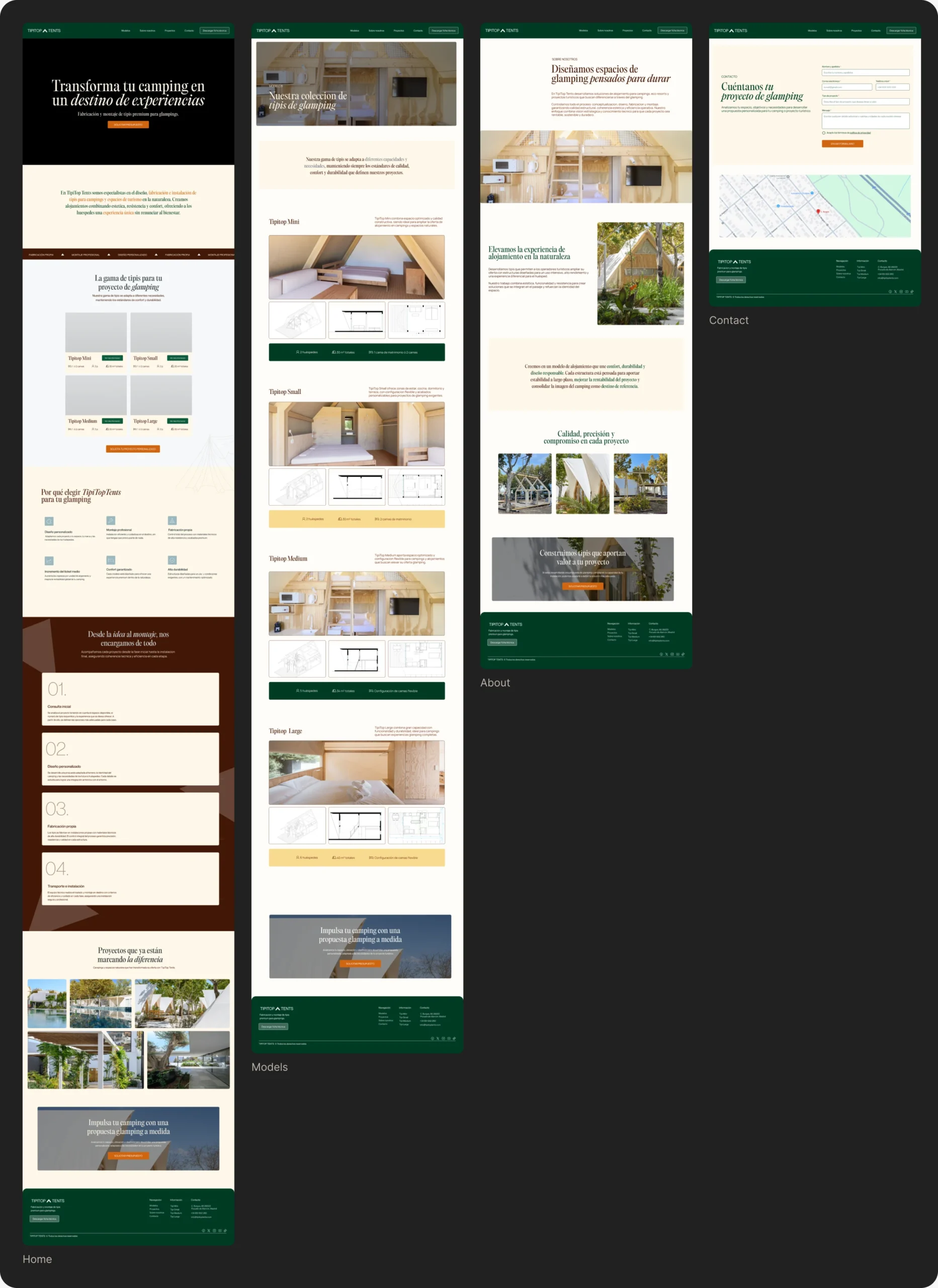
One job per page
The old site had blocks with no separation and no path. I weighed a single long page against a catalogue-first menu, and went for four pages that each move the buyer one step closer to a quote.
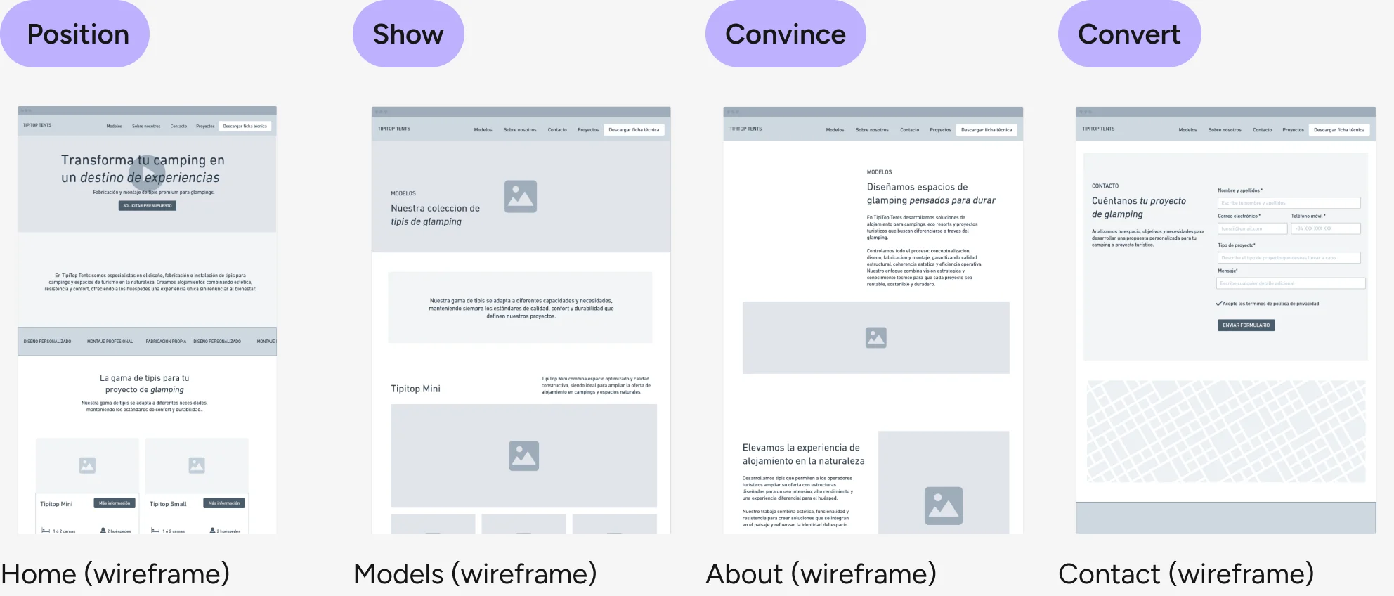
Position Show Convince Convert
Why
A B2B buyer needs to understand, compare and trust before getting in touch. Giving each page one job keeps that order, and every page ends in the same quote form.
How I would measure it
Quote requests per visit, and how many visitors reach the Models page and then the quote form. Tool: GA4 events plus form submissions.
A premium brand, from logo to system
The original mark lost legibility at small sizes, exactly where a website shows it most: the header and the favicon. I considered recolouring it or drawing a new one, and chose to simplify the existing mark: cleaner form, new proportions, built for screen.
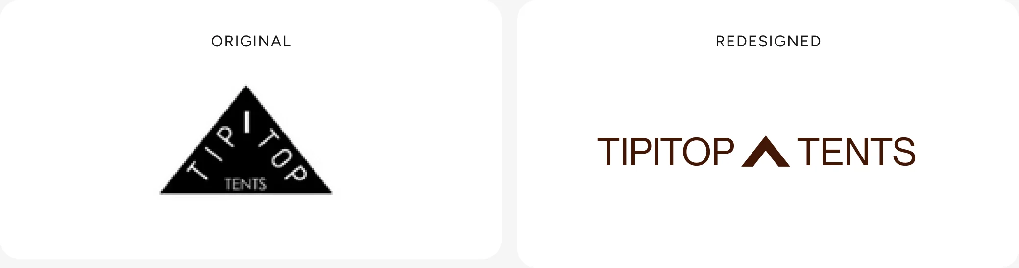
Colour and type had the same problem: they decorated instead of communicating. So I solved them together, as one system.
- Nature
#003B26 - Trust
#FEF8E9 - Action
#D0650F - Premium
#F4C155
- PP Editorial Old for headlines: craft and character where the eye lands first
- Neue Montreal for reading: clean and comfortable on any screen
Why
It keeps the recognition TipiTop already had and fixes the real problem. Giving each colour a single job means orange always means “act here”.
How I would measure it
A 5-second test with campsite owners: do they describe the brand as premium? Plus time to the first click on the quote button.
Accessible by default
WCAG AA, AAA where possible.
- Better contrast in every text / background pair
- More comfortable type sizes
- Structured semantic hierarchy
- Clearer forms with real labels
Why
Accessibility problems were also conversion problems: a form without labels loses leads.
How I would measure it
Lighthouse accessibility score before and after, and form completion: forms started versus forms sent.
Why this work matters
TipiTop isn’t live yet, so there are no conversion numbers to show. What I can show is the accessibility jump, and the three signals I’d track from launch day.
00 → 00
Accessibility score before and after the redesign, with best practices and SEO measured on the same run.
Quote requests per visit
How many visitors reach Models and then the quote form. Tracked with GA4 events.
Perceived as premium
A 5-second test with campsite owners: do they describe the brand as premium?
Forms sent, not just started
Form completion rate: forms started versus forms sent.
What I learned
Key takeaway
Designing for a B2B buyer means trust first. A beautiful tipi isn’t enough, they need to see real installations, understand the numbers and have one obvious next step.
With more time, I’d…
- Show real campsites and partners that already use TipiTop
- Add testimonials from campsites and tourism companies
- Bring in subtle micro-interactions to give the page rhythm
- Optimise the whole site for conversion and SEO
With less time, I’d…
Ship only Home and Models, the two pages that carry the premium story and the product choice, and leave About and Contact for a second iteration.
That’s the short version. The full process is below if you want the evidence.
- Reinforce the premium perception
- Clarify the value proposition
- Improve visual hierarchy
- Simplify navigation
- Drive qualified leads
- Make it accessible to everyone
Auditing the original site
Before designing anything I audited the site on four fronts: visual identity, hierarchy and content, accessibility and usability, and a technical check with Lighthouse.
Visual identity
- Logo hard to read at small sizes and on screen
- No type system or differentiated hierarchy
- A palette without strategic intent or brand coherence
Hierarchy & content
- Little difference between levels of information
- No experiential narrative tied to the glamping concept
- Content blocks with almost no visual separation
Accessibility & usability
- Insufficient contrast in some text / background pairs
- Legal pages linked in the menu but with no content
- Form fields relying only on placeholders, no labels
Lighthouse technical check
- Images without alt text, invisible to screen readers and search engines
- Links without accessible text
- Headings out of order: the semantic structure was broken
From structure to interface
I started in low fidelity to agree layout and hierarchy before adding the brand.
Home: low-fidelity wireframe → final design.
Feedback and iterations
Agencies rarely have time for formal testing, so I validate with what we have: client feedback rounds, team reviews and quick checks. This is what changed because of it.
How I validated it
- Self-review against WCAG and Lighthouse
- Review of the proposal with the hiring team
- Next: usability test with 5 campsite owners